Sculpting Bio-Synergies (UO Thesis Work)
Documenting My Thesis project progress From Prep.to Review.
Saturday, August 20, 2011
Thursday, June 9, 2011
Tuesday, June 7, 2011
Sunday, June 5, 2011
Final Review
 |
| Final Thesis Presentation@ Yale Union Building. |
My Final thesis review went better than I could have ever expect. It made all of those sleepless nights well worth it. What made me feel confident about how my review turned out was the dialogue I had with Professor emeritus Jim Pettinari during the review. His presence there allowed the majority of our conversations to facilitate around the idea of using transportation to foster community and how this site lends itself well to being a public place. The majority of the reviewers comments were that they could really get a sense for my particular vision for the future of the Gateway neighborhood and felt like it was a very believable. Other comments included a missed opportunity for the building to provide more coverage for transistors from the busses to the LRT due to Portland's rainy climate.
They also appreciated the boardwalk/bio-swale as not only a functional aspect to the project in terms of storm water treatment, but also as a way of organizing transit and being the continuity to aid in way finding.
They were a little skeptical to the TEDx idea as being the right kind of program to activate the site, and I agree with them. The TEDx served as a way to entertain architectural design decisions, but was never the main focus of my thesis. As a building it was challenging to get it just right, but in the end could have been a much better building. What is important to take from this type of program is the idea of building something for the community that they can identify with and call their own. It will have a much better success rate and the community will be more likely to let you build more and shape their neighborhood if you can show them something that is successful. The placement of a hotel or some cheap mixed use would be a tough sell to this community.
In the end none of this would have been possible without the help from all of my UO professors, mentor James McGrath, fellow design peers, my wonderful girlfriend, dear friend David Salamon, and my family.
Thank You.
IMAGES OF BOARDS
 |
| URBAN BOARD: Alignment proposal, master plan, phasing diagrams, rendered site plan |
 |
| board1: ENTRY SHOT Site Section(building Section), sustainability(structure) diagram |
 |
| Board 2: ENTRY FROM LRT site section with S. Elevation |
 |
| Board 3: EXHIBITION SPACE building plan structure plan partial RCP |
 |
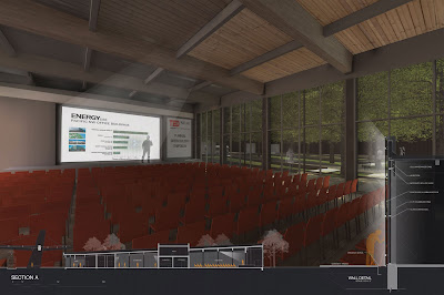
| Board 4: EVENT ROOM building section and wall detail |
Sunday, May 22, 2011
Board Mock
 |
| mock up for review boards (8'x12') |
Im debating putting together three small booklets that will have site photos/research that I can pass out so that the reviewers can thumb through them as I present. The book will demonstrate the research but also not clutter my presentation boards.
The Urban focus set of boards will allow viewers to understand the extent of this project and see how important transportation is to urbanization.
The site focus board is the design proposal, highlighting the elements of the entire site as a plaza.
The Building board will get into the specifics relating the programatic portion of the site.
Monday, May 9, 2011
Sustainability Review
Well todays review was bitter sweet. I completely agree with the criticism from my reviewers, however I feel like I am not in the position to make or re-examine how I could incorporate their suggestions.
I will just have to prioritize their comments and tackle the ones that are manageable, i.e. will take the shortest time or require the minimal revamping.
Their comments in general were spot on. They understood where I was coming from, although some earlier diagrams could have made my argument easier. Basically they liked and appreciated the simplicity of the building however found it to be architecturally uninteresting and did not see how the spaces and form making were informed by "bio-synergies" I admit Bio-synergies has not been my main focus, however I did choose to develop my project in Gateway because of its Eco-district background. I feel like approaching architecture from and Urban design standpoint has made me value both practices even more, and can now see that it is the balance between the two that allows for the most successes.
They had a lot of ideas and suggestions about how to make my building respond more to climatic and user stimuli, however I worry exploring those route will only leave me high and dry come the final review.
I will take away from this review a little insight to how my final review might go, and begin to think about more thoughtful answers to the tough question that stand before me.
The reviewers appreciated the graphic representation of the ideas and building components and mentioned that it was this clarity that made it so easy to pick at. That made me smile.
Saturday, May 7, 2011
Day Light Model
Tested out the quality of light in the auditorium portion of my building. The translucent panels keep a consistent glow in this space in all seasons for all times of the day. The wood battens add contrast near the stage to make presentations visible even during the brightest times of day. Roller shades will be added to the interior of the Double skin wall to allow for very low light levels when desired.
Subscribe to:
Posts (Atom)


